Brexit Vote Analysis

In this project, we aim to analyse data of Brexit Vote to see its distribution and whether Brexit is mainly driven by the fear of immigration.
First, load the packages needed.
library(tidyverse)  # Load ggplot2, dplyr, and all the other tidyverse packages
library(gapminder)  # gapminder dataset
library(here)
library(janitor)
library(skimr)
Then we read the data using read_csv() and have a quick glimpse at the data
brexit_results <- read_csv(here::here("data","brexit_results.csv"))

glimpse(brexit_results)
## Rows: 632
## Columns: 11
## $ Seat <chr> "Aldershot", "Aldridge-Brownhills", "Altrincham and Sale W~
## $ con_2015 <dbl> 50.592, 52.050, 52.994, 43.979, 60.788, 22.418, 52.454, 22~
## $ lab_2015 <dbl> 18.333, 22.369, 26.686, 34.781, 11.197, 41.022, 18.441, 49~
## $ ld_2015 <dbl> 8.824, 3.367, 8.383, 2.975, 7.192, 14.828, 5.984, 2.423, 1~
## $ ukip_2015 <dbl> 17.867, 19.624, 8.011, 15.887, 14.438, 21.409, 18.821, 21.~
## $ leave_share <dbl> 57.89777, 67.79635, 38.58780, 65.29912, 49.70111, 70.47289~
## $ born_in_uk <dbl> 83.10464, 96.12207, 90.48566, 97.30437, 93.33793, 96.96214~
## $ male <dbl> 49.89896, 48.92951, 48.90621, 49.21657, 48.00189, 49.17185~
## $ unemployed <dbl> 3.637000, 4.553607, 3.039963, 4.261173, 2.468100, 4.742731~
## $ degree <dbl> 13.870661, 9.974114, 28.600135, 9.336294, 18.775591, 6.085~
## $ age_18to24 <dbl> 9.406093, 7.325850, 6.437453, 7.747801, 5.734730, 8.209863~The data comes from Elliott Morris, who cleaned it and made it available through his DataCamp class on analysing election and polling data in R.
Our main outcome variable (or y) is leave_share, which is the percent of votes cast in favour of Brexit, or leaving the EU. Each row is a UK parliament constituency.
To get a sense of the spread, or distribution, of the data, we can plot a histogram, a density plot, and the empirical cumulative distribution function of the leave % in all constituencies.
# histogram
ggplot(brexit_results, aes(x = leave_share)) +
  geom_histogram(binwidth = 2.5) +
  labs(title = 'Brexit Leave Share Histogram',
      subtitle = 'The most common leave share is slightly below 60%',
      x = 'Leave Share (%)',
      y = 'Count')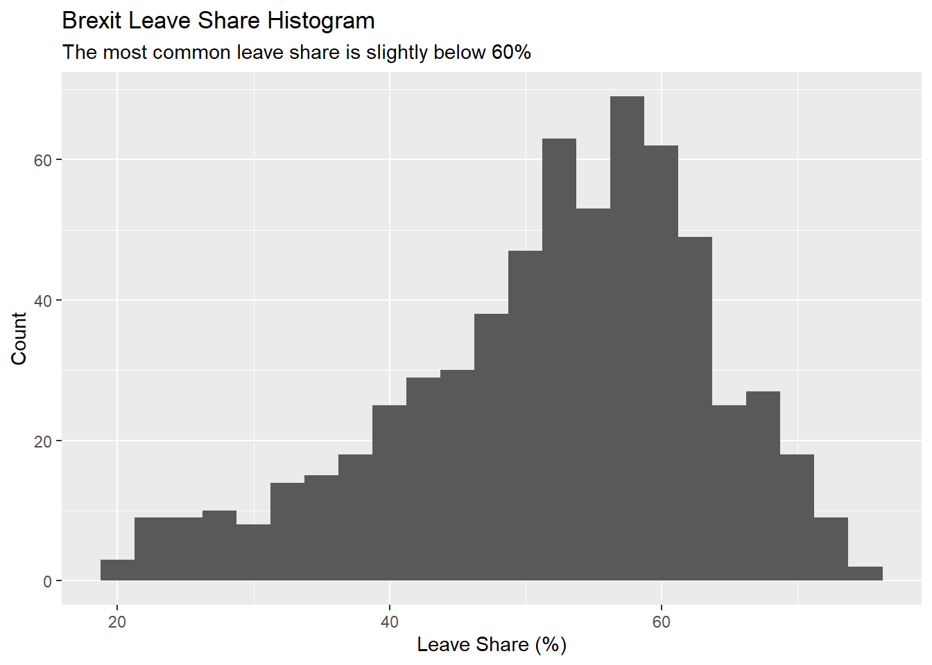
# density plot
ggplot(brexit_results, aes(x = leave_share)) +
  geom_density() +
  labs(title = 'Brexit Leave Share Density Plot',
      subtitle = 'The leave share by seat is skewed at around 58%',
      x = 'Leave Share (%)',
y = 'Density') 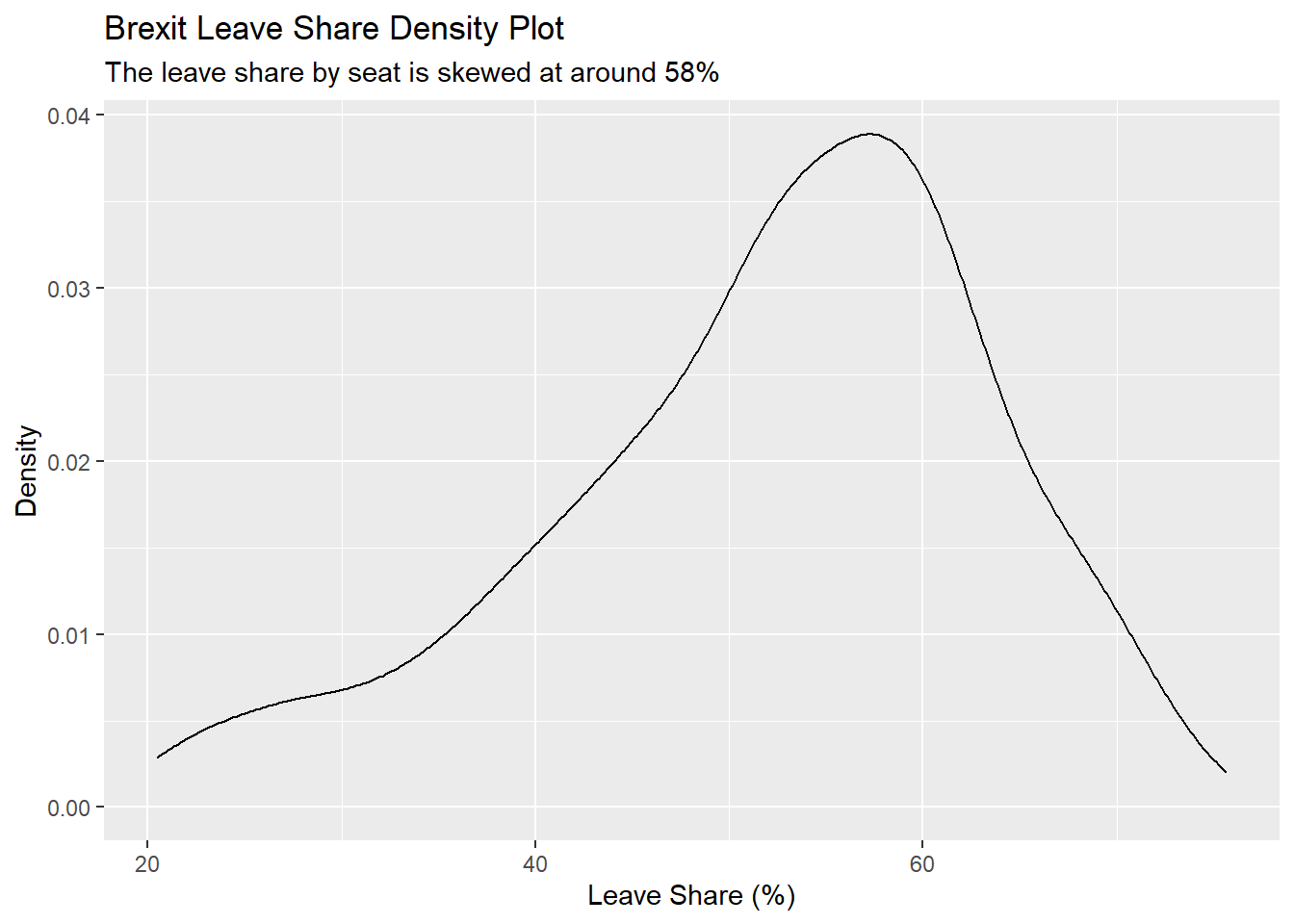
# The empirical cumulative distribution function (ECDF)
ggplot(brexit_results, aes(x = leave_share)) +
  stat_ecdf(geom = "step", pad = FALSE) +
  scale_y_continuous(labels = scales::percent) +
  labs(title = 'Brexit Leave Share Empirical Cumulative Distribution Function',
      subtitle = 'Around half of all seats have a leave share above 53%',
      x = 'Leave Share (%)',
      y = 'Cumulative Frequency')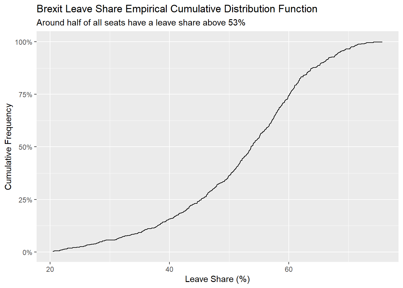
One common explanation for the Brexit outcome was fear of immigration and opposition to the EU’s more open border policy. We can check the relationship (or correlation) between the proportion of native born residents (born_in_uk) in a constituency and its leave_share. To do this, let us get the correlation between the two variables
brexit_results %>%
  select(leave_share, born_in_uk) %>%
  cor()
## leave_share born_in_uk
## leave_share 1.0000000 0.4934295
## born_in_uk 0.4934295 1.0000000The correlation is almost 0.5, which shows that the two variables are positively correlated.
We can also create a scatterplot between these two variables using geom_point. We also add the best fit line, using geom_smooth(method = "lm").
ggplot(brexit_results, aes(x = born_in_uk, y = leave_share)) +
  geom_point(alpha=0.3) +

  # add a smoothing line
  geom_smooth(method = "lm") +

  labs(title = 'Brexit Leave Share vs. Percentage Born in UK by Seat Scatterplot',
      subtitle = 'Slight positive correlation between the two varibales can be observed',
      x = 'Born in UK (%)',
      y = 'Leave Share (%)') +

  # use a white background and frame the plot with a black box
  theme_bw() +

  NULL
## `geom_smooth()` using formula 'y ~ x'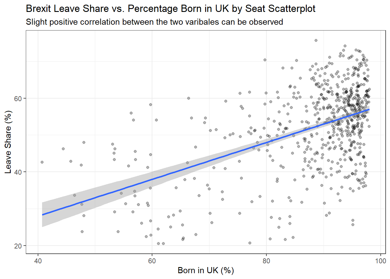
Now, we can make some observations. From the histogram, density plot, and empirical distribution function, it can be observed that most seats (I understood as regions) have a leave share between 45% to 60%; only a small portion of seats have extremely low or high leave shares. This observation suggests that in general most regions are rather conflicted in whether to vote for or against Brexit, as opposed to the situation where some regions are strongly against and some strongly support Brexit. Another observation is that over half the regions have a leave share of 50% or higher, which is also reasonable as eventually UK agreed on Brexit.
On the other hand, the around 0.5 correlation between variables born in UK and leave share suggests that these two variables are related to a degree, but not too overwhelmingly. In real world, such correlation proves that concerns regarding immigration by local resident is likely to be a factor contributing to Brexit, but unlikely to be the dominant nor only factor.