Gapminder Country Comparison
The gapminder dataset from R gapminder package has data on life expectancy, population, and GDP per capita for 142 countries from 1952 to 2007. The aim of the project today is to have a glance at how the average life expectancy of across 5 continents changed over the past 55 years.
First, load the packages needed.
library(tidyverse)  # Load ggplot2, dplyr, and all the other tidyverse packages
library(gapminder)  # gapminder dataset
library(here)
library(janitor)
library(skimr)
Then we have a look at the completness and first 20 rows of the data.
skim(gapminder)| Name | gapminder |
| Number of rows | 1704 |
| Number of columns | 6 |
| _______________________ | |
| Column type frequency: | |
| factor | 2 |
| numeric | 4 |
| ________________________ | |
| Group variables | None |
Variable type: factor
| skim_variable | n_missing | complete_rate | ordered | n_unique | top_counts |
|---|---|---|---|---|---|
| country | 0 | 1 | FALSE | 142 | Afg: 12, Alb: 12, Alg: 12, Ang: 12 |
| continent | 0 | 1 | FALSE | 5 | Afr: 624, Asi: 396, Eur: 360, Ame: 300 |
Variable type: numeric
| skim_variable | n_missing | complete_rate | mean | sd | p0 | p25 | p50 | p75 | p100 | hist |
|---|---|---|---|---|---|---|---|---|---|---|
| year | 0 | 1 | 1979.50 | 17.27 | 1952.00 | 1965.75 | 1979.50 | 1993.25 | 2007.0 | ▇▅▅▅▇ |
| lifeExp | 0 | 1 | 59.47 | 12.92 | 23.60 | 48.20 | 60.71 | 70.85 | 82.6 | ▁▆▇▇▇ |
| pop | 0 | 1 | 29601212.32 | 106157896.74 | 60011.00 | 2793664.00 | 7023595.50 | 19585221.75 | 1318683096.0 | ▇▁▁▁▁ |
| gdpPercap | 0 | 1 | 7215.33 | 9857.45 | 241.17 | 1202.06 | 3531.85 | 9325.46 | 113523.1 | ▇▁▁▁▁ |
head(gapminder, 20) ## # A tibble: 20 x 6
## country continent year lifeExp pop gdpPercap
## <fct> <fct> <int> <dbl> <int> <dbl>
## 1 Afghanistan Asia 1952 28.8 8425333 779.
## 2 Afghanistan Asia 1957 30.3 9240934 821.
## 3 Afghanistan Asia 1962 32.0 10267083 853.
## 4 Afghanistan Asia 1967 34.0 11537966 836.
## 5 Afghanistan Asia 1972 36.1 13079460 740.
## 6 Afghanistan Asia 1977 38.4 14880372 786.
## 7 Afghanistan Asia 1982 39.9 12881816 978.
## 8 Afghanistan Asia 1987 40.8 13867957 852.
## 9 Afghanistan Asia 1992 41.7 16317921 649.
## 10 Afghanistan Asia 1997 41.8 22227415 635.
## 11 Afghanistan Asia 2002 42.1 25268405 727.
## 12 Afghanistan Asia 2007 43.8 31889923 975.
## 13 Albania Europe 1952 55.2 1282697 1601.
## 14 Albania Europe 1957 59.3 1476505 1942.
## 15 Albania Europe 1962 64.8 1728137 2313.
## 16 Albania Europe 1967 66.2 1984060 2760.
## 17 Albania Europe 1972 67.7 2263554 3313.
## 18 Albania Europe 1977 68.9 2509048 3533.
## 19 Albania Europe 1982 70.4 2780097 3631.
## 20 Albania Europe 1987 72 3075321 3739.We begin the analysis by producing two graphs on how life expectancy has changed over the years for the country and the continent I come from.
# filter the gapminder dataset for specific country and continent, then assigning separately to two datasets
country_data <- gapminder %>%
            filter(country == 'New Zealand')

continent_data <- gapminder %>%
            filter(continent == "Oceania")
A plot of life expectancy over time for the single country I come from is created by map year on the x-axis, and lifeExp on the y-axis.
# create the plot
plot1 <- ggplot(data = country_data, mapping = aes(x = year,y = lifeExp))+
  # add the data points
  geom_point() +
  # generate a line of best fit
  geom_smooth(se = FALSE) +
  NULL

 plot1
## `geom_smooth()` using method = 'loess' and formula 'y ~ x'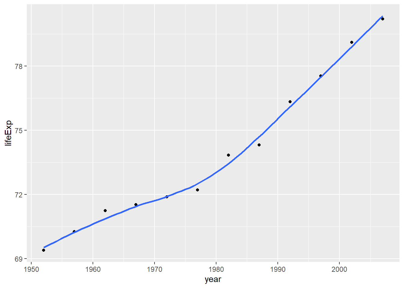
Next I want to add a title, using the labs() function.
# add an informative title to plot1
 plot1<- plot1 +
   labs(title = "New Zealand Change in Life Expectancy 1952-2007",
       x = " ",
       y = " ") +
   NULL

 plot1
## `geom_smooth()` using method = 'loess' and formula 'y ~ x'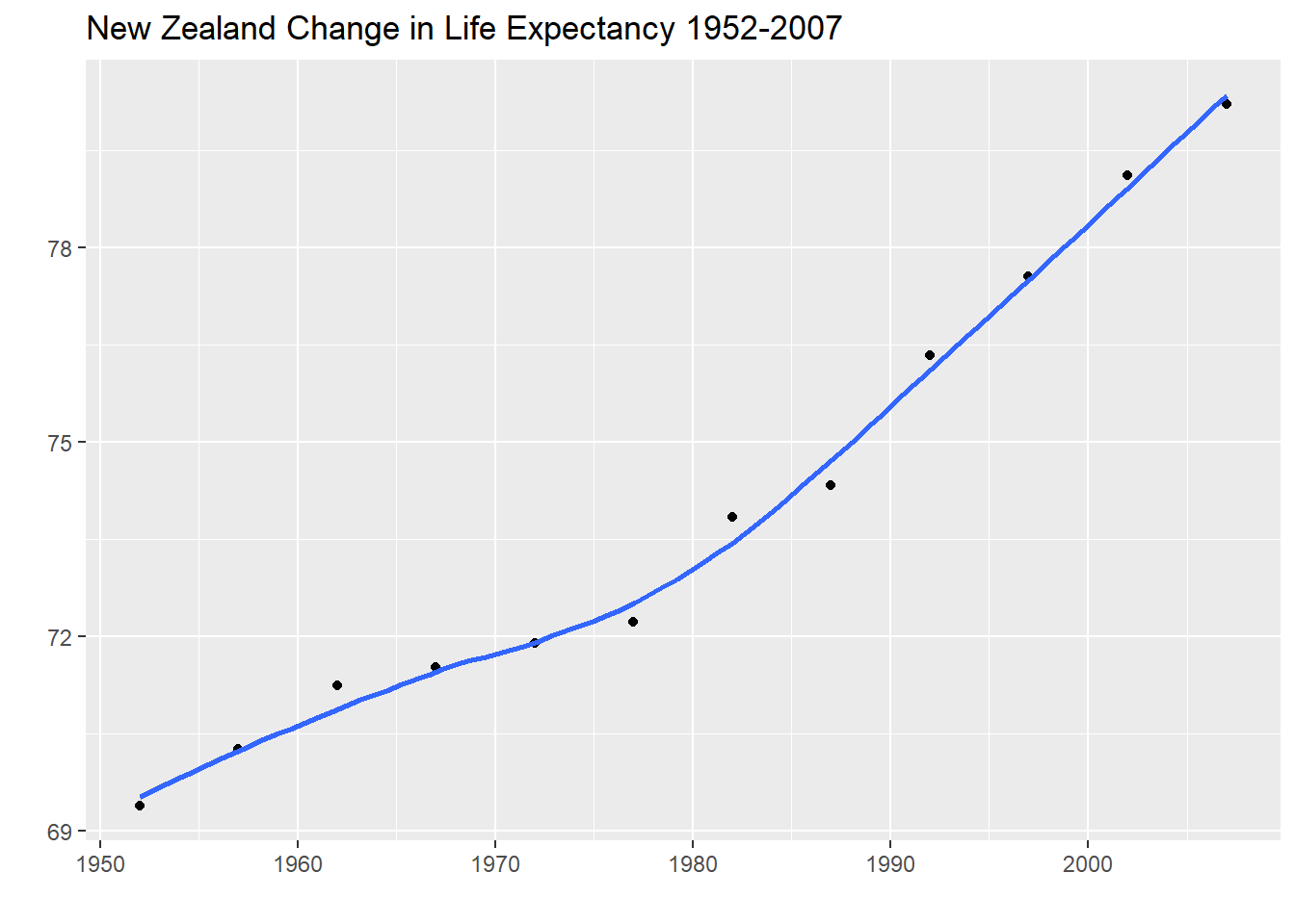
Similarly, a plot for all countries in the continent I come from is produced, where the country variable is mapped on both the colour and group aesthetic to show the countries by different colour but also group them together when computing line of best fit.
# create the plot
 ggplot(continent_data, mapping = aes(x = year , y =  lifeExp, colour= country, group =country))+
   geom_point() +
   geom_smooth(se = FALSE) +
   labs(title = "Oceania Change in Life Expectancy 1952-2007")
## `geom_smooth()` using method = 'loess' and formula 'y ~ x'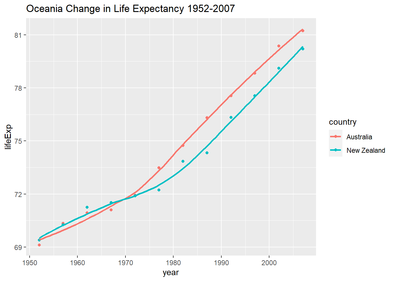
NULL## NULLFinally, using the original gapminder data, I produced a life expectancy over time graph, faceted by continent. I removed all legends by adding the theme(legend.position="none") at the end of our ggplot.
# create the plot
 ggplot(data = gapminder , mapping = aes(x = year, y =  lifeExp, color= continent))+
   geom_point() +
   geom_smooth(se = FALSE) +
   facet_wrap(~continent) +
   theme(legend.position="none") + # remove all legends
   labs(title = "World Change in Life Expectancy 1952-2007 Faceted by Continents") +
   NULL
## `geom_smooth()` using method = 'loess' and formula 'y ~ x'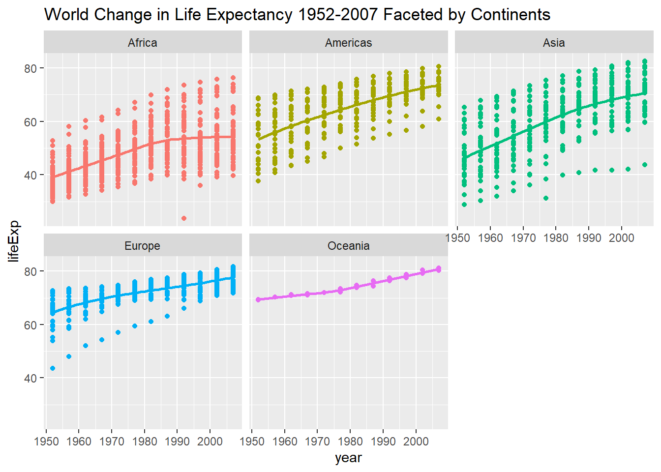
After plotting the graphs, we can have a careful look at them. Several observations can be made, especially on the differences among continents:
Geneal Trend: First and most general observation is that the life expectancy in all continents have been increasing in the past years since 1952, likely because of development in technology that improved everyone’s life quality. Besides, in all continents apart from Oceania, which has too small a sample size of only two countries, the rate of increase in life expectancy is slowing down. This signifies to a degree a halt of significant development in life sciences and related technologies.
By Continent: Going down to the continent level, Oceania has the highest life expectancy, followed closely by America and Europe, whereas Asia and Africa lie further behind. Such difference represents to a degree the difference in wealth level and average living standards among continents. Furthermore, interesting patterns can be observed in distribution of life expectancy of each country within each continent. Oceania has only two countries and their life expectancy are rather similar. In Europe, most countries have rather long and similar life expectancies, apart from one outlier which was extraordinarily low from 1950 to 1990 but caught up since then. This suggests that most countries in Europe are quite well developed, perhaps apart one which only caught up after 1990. On the other hand, Africa, America and Asia have much wider distribution in life expectancy by country, showing that the level of wealthiness and development in these continents are more differentiated.