Group Project Three

Youth Risk Behavior Surveillance
Every two years, the Centers for Disease Control and Prevention conduct the Youth Risk Behavior Surveillance System (YRBSS) survey, where it takes data from high schoolers (9th through 12th grade), to analyze health patterns.
Load the data
This data is part of the openintro textbook and we can load and inspect it. There are observations on 13 different variables, some categorical and some numerical. The meaning of each variable can be found by bringing up the help file:
?yrbss
data(yrbss)
glimpse(yrbss)
## Rows: 13,583
## Columns: 13
## $ age <int> 14, 14, 15, 15, 15, 15, 15, 14, 15, 15, 15, 1~
## $ gender <chr> "female", "female", "female", "female", "fema~
## $ grade <chr> "9", "9", "9", "9", "9", "9", "9", "9", "9", ~
## $ hispanic <chr> "not", "not", "hispanic", "not", "not", "not"~
## $ race <chr> "Black or African American", "Black or Africa~
## $ height <dbl> NA, NA, 1.73, 1.60, 1.50, 1.57, 1.65, 1.88, 1~
## $ weight <dbl> NA, NA, 84.4, 55.8, 46.7, 67.1, 131.5, 71.2, ~
## $ helmet_12m <chr> "never", "never", "never", "never", "did not ~
## $ text_while_driving_30d <chr> "0", NA, "30", "0", "did not drive", "did not~
## $ physically_active_7d <int> 4, 2, 7, 0, 2, 1, 4, 4, 5, 0, 0, 0, 4, 7, 7, ~
## $ hours_tv_per_school_day <chr> "5+", "5+", "5+", "2", "3", "5+", "5+", "5+",~
## $ strength_training_7d <int> 0, 0, 0, 0, 1, 0, 2, 0, 3, 0, 3, 0, 0, 7, 7, ~
## $ school_night_hours_sleep <chr> "8", "6", "<5", "6", "9", "8", "9", "6", "<5"~Before we carry on with our analysis, it’s is always a good idea to check with skimr::skim() to get a feel for missing values, summary statistics of numerical variables, and a very rough histogram.
skim(yrbss)| Name | yrbss |
| Number of rows | 13583 |
| Number of columns | 13 |
| _______________________ | |
| Column type frequency: | |
| character | 8 |
| numeric | 5 |
| ________________________ | |
| Group variables | None |
Variable type: character
| skim_variable | n_missing | complete_rate | min | max | empty | n_unique | whitespace |
|---|---|---|---|---|---|---|---|
| gender | 12 | 1.00 | 4 | 6 | 0 | 2 | 0 |
| grade | 79 | 0.99 | 1 | 5 | 0 | 5 | 0 |
| hispanic | 231 | 0.98 | 3 | 8 | 0 | 2 | 0 |
| race | 2805 | 0.79 | 5 | 41 | 0 | 5 | 0 |
| helmet_12m | 311 | 0.98 | 5 | 12 | 0 | 6 | 0 |
| text_while_driving_30d | 918 | 0.93 | 1 | 13 | 0 | 8 | 0 |
| hours_tv_per_school_day | 338 | 0.98 | 1 | 12 | 0 | 7 | 0 |
| school_night_hours_sleep | 1248 | 0.91 | 1 | 3 | 0 | 7 | 0 |
Variable type: numeric
| skim_variable | n_missing | complete_rate | mean | sd | p0 | p25 | p50 | p75 | p100 | hist |
|---|---|---|---|---|---|---|---|---|---|---|
| age | 77 | 0.99 | 16.16 | 1.26 | 12.00 | 15.0 | 16.00 | 17.00 | 18.00 | ▁▂▅▅▇ |
| height | 1004 | 0.93 | 1.69 | 0.10 | 1.27 | 1.6 | 1.68 | 1.78 | 2.11 | ▁▅▇▃▁ |
| weight | 1004 | 0.93 | 67.91 | 16.90 | 29.94 | 56.2 | 64.41 | 76.20 | 180.99 | ▆▇▂▁▁ |
| physically_active_7d | 273 | 0.98 | 3.90 | 2.56 | 0.00 | 2.0 | 4.00 | 7.00 | 7.00 | ▆▂▅▃▇ |
| strength_training_7d | 1176 | 0.91 | 2.95 | 2.58 | 0.00 | 0.0 | 3.00 | 5.00 | 7.00 | ▇▂▅▂▅ |
Exploratory Data Analysis
We first start with analysing the weight of participants in kilograms. Using visualization and summary statistics, we can describe the distribution of weights:
The distribution of weight is right(positive) skewed. 1004 observations are missed in the weight from.
skim(yrbss)| Name | yrbss |
| Number of rows | 13583 |
| Number of columns | 13 |
| _______________________ | |
| Column type frequency: | |
| character | 8 |
| numeric | 5 |
| ________________________ | |
| Group variables | None |
Variable type: character
| skim_variable | n_missing | complete_rate | min | max | empty | n_unique | whitespace |
|---|---|---|---|---|---|---|---|
| gender | 12 | 1.00 | 4 | 6 | 0 | 2 | 0 |
| grade | 79 | 0.99 | 1 | 5 | 0 | 5 | 0 |
| hispanic | 231 | 0.98 | 3 | 8 | 0 | 2 | 0 |
| race | 2805 | 0.79 | 5 | 41 | 0 | 5 | 0 |
| helmet_12m | 311 | 0.98 | 5 | 12 | 0 | 6 | 0 |
| text_while_driving_30d | 918 | 0.93 | 1 | 13 | 0 | 8 | 0 |
| hours_tv_per_school_day | 338 | 0.98 | 1 | 12 | 0 | 7 | 0 |
| school_night_hours_sleep | 1248 | 0.91 | 1 | 3 | 0 | 7 | 0 |
Variable type: numeric
| skim_variable | n_missing | complete_rate | mean | sd | p0 | p25 | p50 | p75 | p100 | hist |
|---|---|---|---|---|---|---|---|---|---|---|
| age | 77 | 0.99 | 16.16 | 1.26 | 12.00 | 15.0 | 16.00 | 17.00 | 18.00 | ▁▂▅▅▇ |
| height | 1004 | 0.93 | 1.69 | 0.10 | 1.27 | 1.6 | 1.68 | 1.78 | 2.11 | ▁▅▇▃▁ |
| weight | 1004 | 0.93 | 67.91 | 16.90 | 29.94 | 56.2 | 64.41 | 76.20 | 180.99 | ▆▇▂▁▁ |
| physically_active_7d | 273 | 0.98 | 3.90 | 2.56 | 0.00 | 2.0 | 4.00 | 7.00 | 7.00 | ▆▂▅▃▇ |
| strength_training_7d | 1176 | 0.91 | 2.95 | 2.58 | 0.00 | 0.0 | 3.00 | 5.00 | 7.00 | ▇▂▅▂▅ |
ggplot(data = yrbss)+
geom_density(aes(x = weight), kernel = "gaussian") 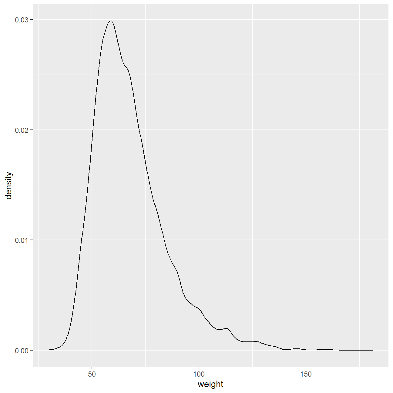
Next, consider the possible relationship between a high schooler’s weight and their physical activity. Plotting the data is a useful first step because it helps us quickly visualize trends, identify strong associations, and develop research questions.
Let’s create a new variable in the dataframe yrbss, called physical_3plus , which will be yes if they are physically active for at least 3 days a week, and no otherwise.
yrbss <- yrbss %>%
  # count(physically_active_7d) %>%
  mutate(yrbss,physical_3plus = ifelse(physically_active_7d >= 3,"yes","no"))


yrbss_count <- yrbss %>%
  count(physical_3plus) %>%
  mutate(perc = n/sum(n))
yrbss_count
## # A tibble: 3 x 3
## physical_3plus n perc
## <chr> <int> <dbl>
## 1 no 4404 0.324
## 2 yes 8906 0.656
## 3 <NA> 273 0.0201There is a slightly positive relationship between thse two variables. I expected that there would be positive relationship between physical_3plus and weight because if people did more execrises per week, they would have more muscles which would be much heavier that fat.
ybrss_physical3minus <-
  filter(yrbss, physical_3plus == "no")
# ybrss_physical3minus
# yrbss
ggplot(data = yrbss,aes(x = physical_3plus, y =weight))+
  geom_boxplot()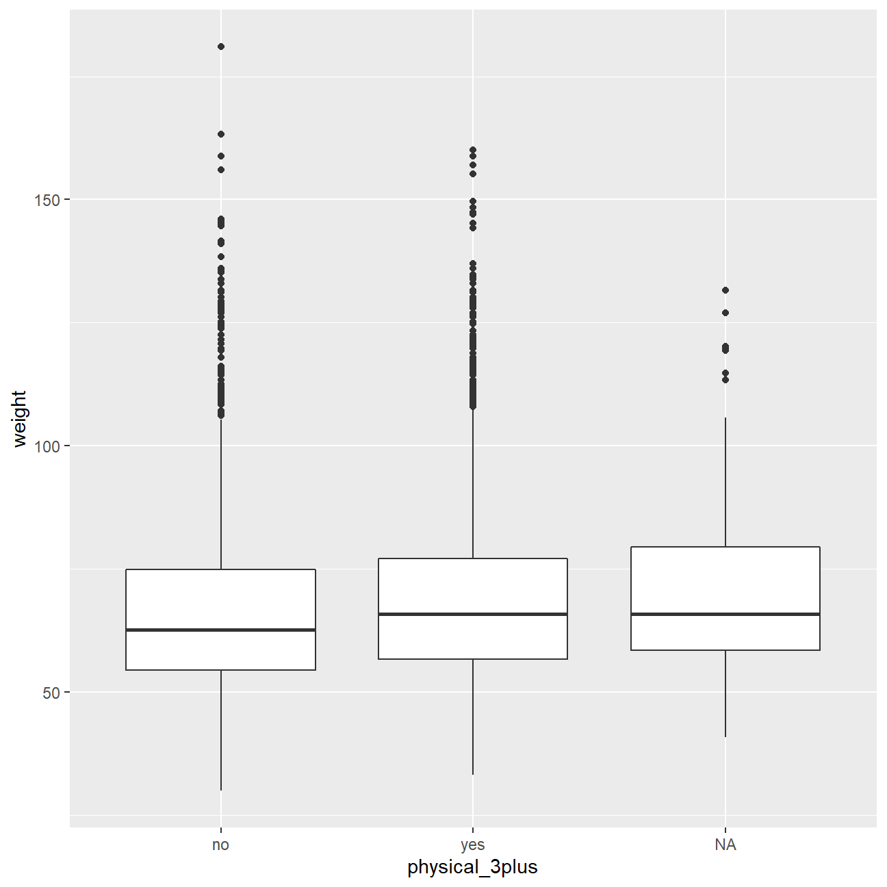
Confidence Interval
Boxplots show how the medians of the two distributions compare, but we can also compare the means of the distributions using either a confidence interval or a hypothesis test. Note that when we calculate the mean, SD, etc. weight in these groups using the mean function, we must ignore any missing values by setting the na.rm = TRUE.
# t.test(weight ~ physical_3plus, data = yrbss)
yrbss %>%
  group_by(physical_3plus) %>%
  summarise(mean_weight = mean(weight,na.rm = TRUE))
## # A tibble: 3 x 2
## physical_3plus mean_weight
## <chr> <dbl>
## 1 no 66.7
## 2 yes 68.4
## 3 <NA> 69.9There is an observed difference of about 1.77kg (68.44 - 66.67), and we notice that the two confidence intervals do not overlap. It seems that the difference is at least 95% statistically significant. Let us also conduct a hypothesis test.
Hypothesis test with formula
The null hypotheses : The mean weights of people who exercise at least times a week is the same as the mean weights of people who don’t. The alternative hypothesesz: The mean weights of people who exercise at least times a week is significantly different from the mean weights of people who don’t.
t.test(weight ~ physical_3plus, data = yrbss)##
## Welch Two Sample t-test
##
## data: weight by physical_3plus
## t = -5, df = 7479, p-value = 9e-08
## alternative hypothesis: true difference in means between group no and group yes is not equal to 0
## 95 percent confidence interval:
## -2.42 -1.12
## sample estimates:
## mean in group no mean in group yes
## 66.7 68.4Hypothesis test with infer
Next, we will introduce a new function, hypothesize, that falls into the infer workflow. We will use this method for conducting hypothesis tests.
But first, we need to initialize the test, which we will save as obs_diff.
obs_diff <- yrbss %>%
  specify(weight ~ physical_3plus) %>%
  calculate(stat = "diff in means", order = c("yes", "no"))
obs_diff
## Response: weight (numeric)
## Explanatory: physical_3plus (factor)
## # A tibble: 1 x 1
## stat
## <dbl>
## 1 1.77Notice how we can use the functions specify and calculate again like we did for calculating confidence intervals. Here, though, the statistic we are searching for is the difference in means, with the order being yes - no != 0.
After we have initialized the test, we need to simulate the test on the null distribution, which we will save as null.
null_dist <- yrbss %>%
  # specify variables
  specify(weight ~ physical_3plus) %>%

  # assume independence, i.e, there is no difference
  hypothesize(null = "independence") %>%

  # generate 1000 reps, of type "permute"
  generate(reps = 1000, type = "permute") %>%

  # calculate statistic of difference, namely "diff in means"
  calculate(stat = "diff in means", order = c("yes", "no"))
null_dist
## Response: weight (numeric)
## Explanatory: physical_3plus (factor)
## Null Hypothesis: independence
## # A tibble: 1,000 x 2
## replicate stat
## <int> <dbl>
## 1 1 -0.0818
## 2 2 0.218
## 3 3 -0.0576
## 4 4 0.312
## 5 5 0.229
## 6 6 0.397
## 7 7 -0.0132
## 8 8 0.156
## 9 9 0.0601
## 10 10 -0.0137
## # ... with 990 more rowsHere, hypothesize is used to set the null hypothesis as a test for independence, i.e., that there is no difference between the two population means. In one sample cases, the null argument can be set to point to test a hypothesis relative to a point estimate.
Also, note that the type argument within generate is set to permute, which is the argument when generating a null distribution for a hypothesis test.
We can visualize this null distribution with the following code:
ggplot(data = null_dist, aes(x = stat)) +
  geom_histogram()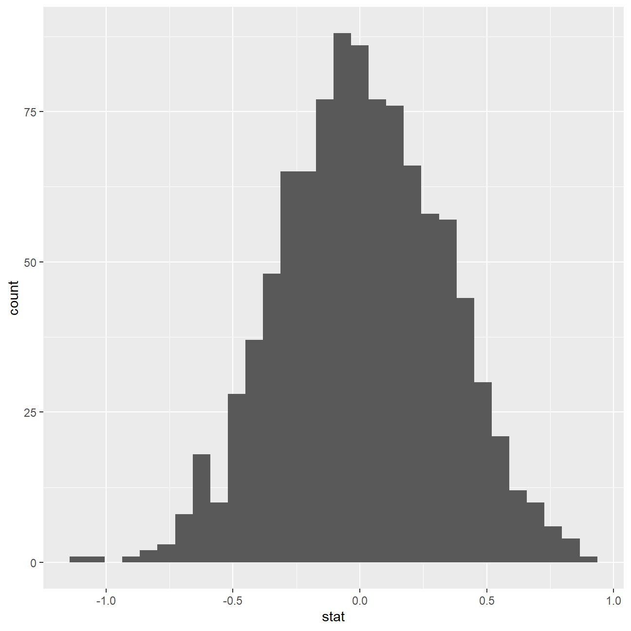
Now that the test is initialized and the null distribution formed, we can visualise to see how many of these null permutations have a difference of at least obs_stat of 1.77?
We can also calculate the p-value for our hypothesis test using the function infer::get_p_value().
null_dist %>% visualize() +
  shade_p_value(obs_stat = obs_diff, direction = "two-sided")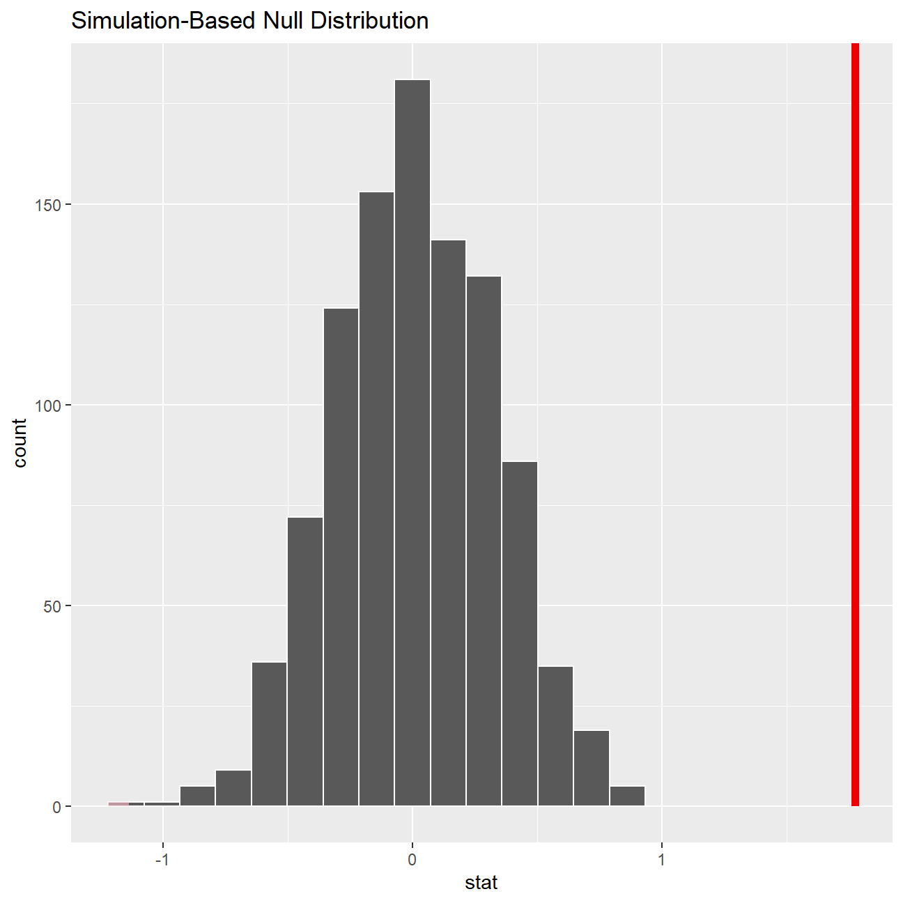
null_dist %>%
  infer::get_p_value(obs_stat = obs_diff, direction = "two_sided")
## # A tibble: 1 x 1
## p_value
## <dbl>
## 1 0This the standard workflow for performing hypothesis tests.
IMDB ratings: Differences between directors
We would like to explore whether the mean IMDB rating for Steven Spielberg and Tim Burton are the same or not by running a hpothesis test.
We can load the data and examine its structure
movies <- read_csv(here::here("data", "movies.csv"))
glimpse(movies)
## Rows: 2,961
## Columns: 11
## $ title <chr> "Avatar", "Titanic", "Jurassic World", "The Avenge~
## $ genre <chr> "Action", "Drama", "Action", "Action", "Action", "~
## $ director <chr> "James Cameron", "James Cameron", "Colin Trevorrow~
## $ year <dbl> 2009, 1997, 2015, 2012, 2008, 1999, 1977, 2015, 20~
## $ duration <dbl> 178, 194, 124, 173, 152, 136, 125, 141, 164, 93, 1~
## $ gross <dbl> 7.61e+08, 6.59e+08, 6.52e+08, 6.23e+08, 5.33e+08, ~
## $ budget <dbl> 2.37e+08, 2.00e+08, 1.50e+08, 2.20e+08, 1.85e+08, ~
## $ cast_facebook_likes <dbl> 4834, 45223, 8458, 87697, 57802, 37723, 13485, 920~
## $ votes <dbl> 886204, 793059, 418214, 995415, 1676169, 534658, 9~
## $ reviews <dbl> 3777, 2843, 1934, 2425, 5312, 3917, 1752, 1752, 35~
## $ rating <dbl> 7.9, 7.7, 7.0, 8.1, 9.0, 6.5, 8.7, 7.5, 8.5, 7.2, ~ci_data <- movies %>%
filter(director %in% c("Steven Spielberg","Tim Burton")) %>%
group_by(director) %>%
summarise(mean_rating = mean(rating),
count = n(),
margin_of_error = qt(0.975, count-1)*sd(rating)/sqrt(count),
rating_lower = mean_rating - margin_of_error,
rating_upper = mean_rating + margin_of_error)
ggplot(ci_data,aes(x = mean_rating, y = reorder(director, desc(director)), colour = director)) +
geom_point(size = 3) +
geom_errorbar(aes(xmin = rating_lower, xmax = rating_upper), width = 0.2, size = 1) +
geom_rect(aes(xmin=max(rating_lower), xmax=min(rating_upper), ymin=0, ymax=Inf), color='grey', alpha=0.2) +
geom_text(aes(label = round(mean_rating, digits = 2), x = mean_rating), size = 6, colour = "black", nudge_y = 0.15)+
geom_text(aes(label = round(rating_lower, digits = 2), x = rating_lower), size = 4, colour = "black",nudge_y = 0.15) +
geom_text(aes(label = round(rating_upper, digits = 2), x = rating_upper), size = 4, colour = "black",nudge_y = 0.15) +
labs(title = "Do Spielberg and Burton have the same mean IMDB ratings?", subtitle = "95% confidence intervals overlap" , x = "Mean IMDB Rating", y = " ") + theme_bw() + theme(legend.position = "none") +
NULL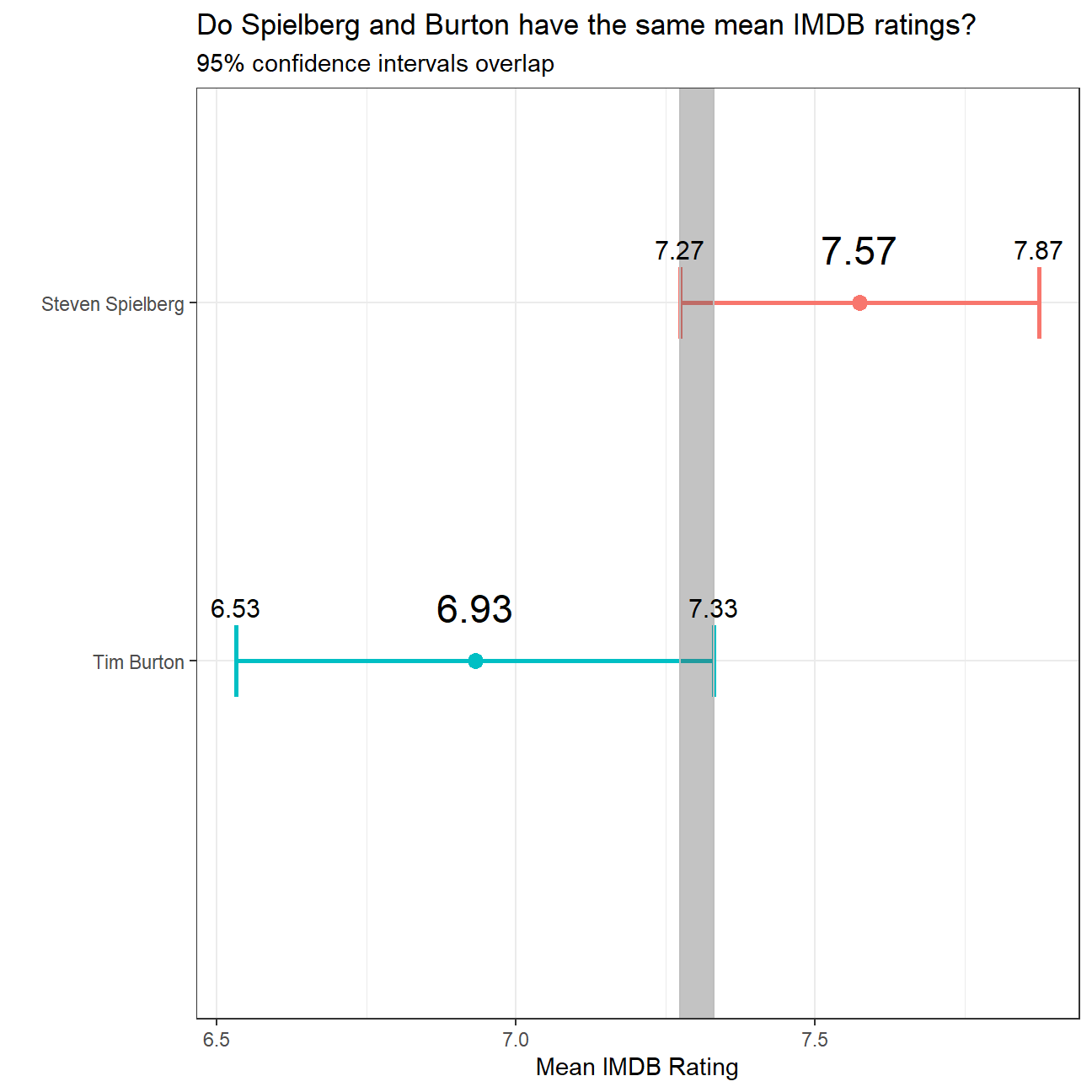
Omega Group plc- Pay Discrimination
At the last board meeting of Omega Group Plc., the headquarters of a large multinational company, the issue was raised that women were being discriminated in the company, in the sense that the salaries were not the same for male and female executives. A quick analysis of a sample of 50 employees (of which 24 men and 26 women) revealed that the average salary for men was about 8,700 higher than for women. This seemed like a considerable difference, so it was decided that a further analysis of the company salaries was warranted.
The objective is to find out whether there is indeed a significant difference between the salaries of men and women, and whether the difference is due to discrimination or whether it is based on another, possibly valid, determining factor.
Loading the data
omega <- read_csv(here::here("data", "omega.csv"))
glimpse(omega) # examine the data frame
## Rows: 50
## Columns: 3
## $ salary <dbl> 81894, 69517, 68589, 74881, 65598, 76840, 78800, 70033, 635~
## $ gender <chr> "male", "male", "male", "male", "male", "male", "male", "ma~
## $ experience <dbl> 16, 25, 15, 33, 16, 19, 32, 34, 1, 44, 7, 14, 33, 19, 24, 3~Relationship Salary - Gender ?
The data frame omega contains the salaries for the sample of 50 executives in the company. Can we conclude that there is a significant difference between the salaries of the male and female executives?
Note that we can perform different types of analyses, and check whether they all lead to the same conclusion
. Confidence intervals . Hypothesis testing . Correlation analysis . Regression
Calculate summary statistics on salary by gender. Also, create and print a dataframe where, for each gender, we show the mean, SD, sample size, the t-critical, the SE, the margin of error, and the low/high endpoints of a 95% condifence interval
# Summary Statistics of salary by gender
mosaic::favstats (salary ~ gender, data=omega)
## gender min Q1 median Q3 max mean sd n missing
## 1 female 47033 60338 64618 70033 78800 64543 7567 26 0
## 2 male 54768 68331 74675 78568 84576 73239 7463 24 0# Dataframe with two rows (male-female) and having as columns gender, mean, SD, sample size,
# the t-critical value, the standard error, the margin of error,
# and the low/high endpoints of a 95% condifence intervalWe can also run a hypothesis testing, assuming as a null hypothesis that the mean difference in salaries is zero, or that, on average, men and women make the same amount of money.
# hypothesis testing using t.test()
t.test(salary ~ gender, data=omega)
##
## Welch Two Sample t-test
##
## data: salary by gender
## t = -4, df = 48, p-value = 2e-04
## alternative hypothesis: true difference in means between group female and group male is not equal to 0
## 95 percent confidence interval:
## -12973 -4420
## sample estimates:
## mean in group female mean in group male
## 64543 73239# hypothesis testing using infer package
obs_diff_2 <- omega %>%
specify(salary ~ gender) %>%
calculate(stat = "diff in means", order = c("female", "male"))
obs_diff_2## Response: salary (numeric)
## Explanatory: gender (factor)
## # A tibble: 1 x 1
## stat
## <dbl>
## 1 -8696.null_dist_2 <- omega %>%
# specify variables
specify(salary ~ gender) %>%
# assume independence, i.e, there is no difference
hypothesize(null = "independence") %>%
# generate 1000 reps, of type "permute"
generate(reps = 1000, type = "permute") %>%
# calculate statistic of difference, namely "diff in means"
calculate(stat = "diff in means", order = c("female", "male"))
null_dist_2## Response: salary (numeric)
## Explanatory: gender (factor)
## Null Hypothesis: independence
## # A tibble: 1,000 x 2
## replicate stat
## <int> <dbl>
## 1 1 -1704.
## 2 2 2626.
## 3 3 469.
## 4 4 519.
## 5 5 -1423.
## 6 6 824.
## 7 7 -92.9
## 8 8 -357.
## 9 9 -126.
## 10 10 -1374.
## # ... with 990 more rowsnull_dist_2 %>% visualize()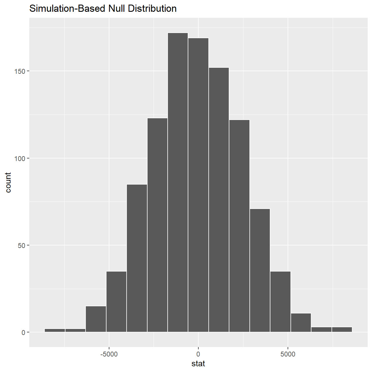
ggplot(data = null_dist_2, aes(x = stat)) +
  geom_histogram()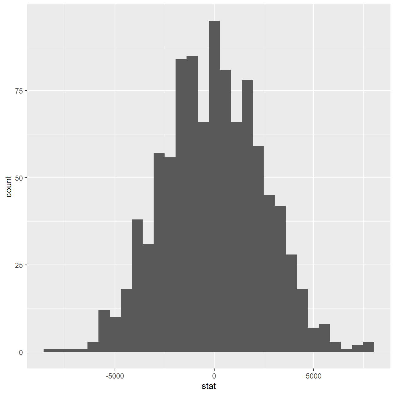
null_dist_2 %>% visualize() +
  shade_p_value(obs_stat = obs_diff_2, direction = "two-sided")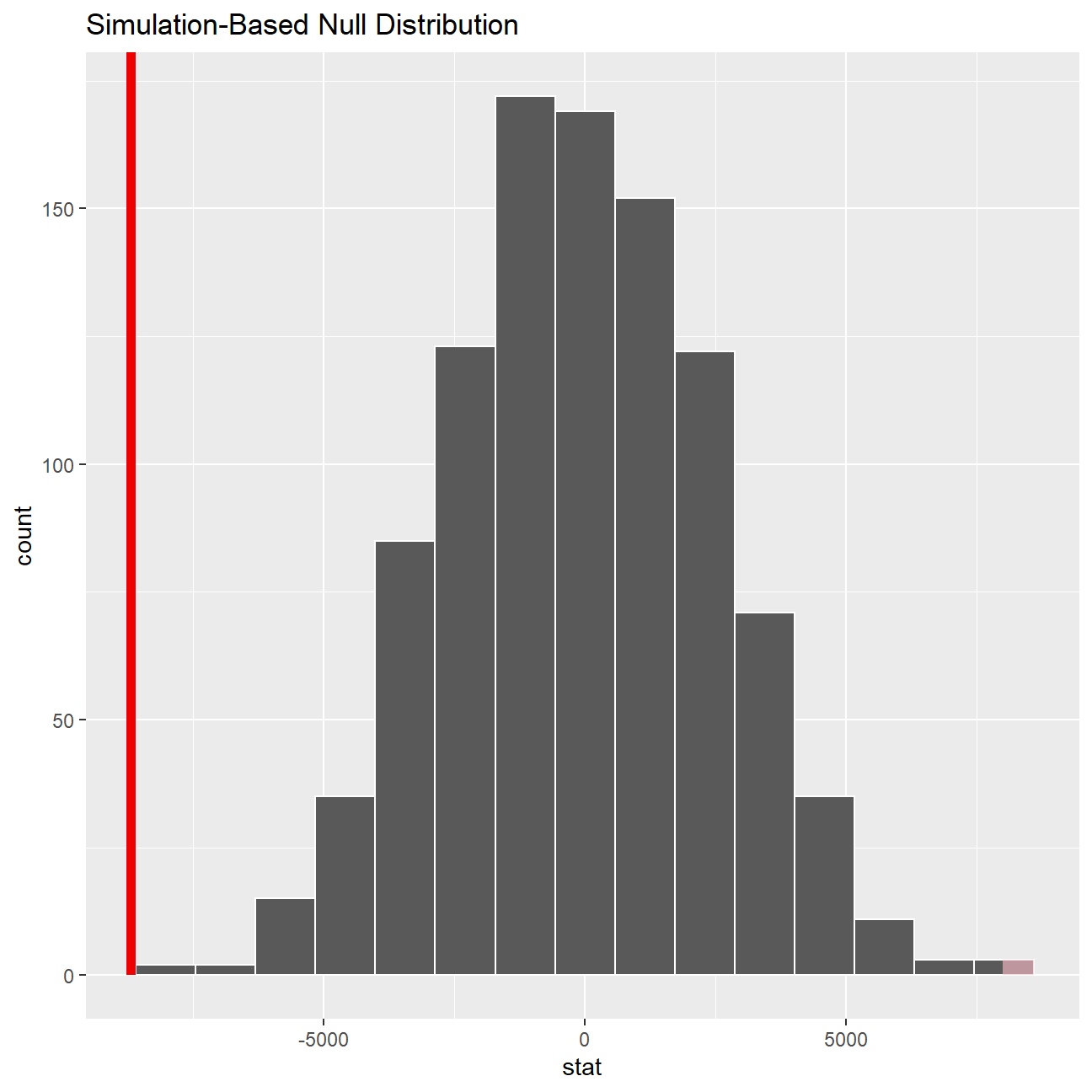
null_dist_2 %>%
  infer::get_p_value(obs_stat = obs_diff_2, direction = "two_sided")
## # A tibble: 1 x 1
## p_value
## <dbl>
## 1 0According to our calculation by t.test, our p-value for the hypothesis test is 0.0001651, which is smaller than 0.05 and hence statistically significant. The p-value we retrieved from our simulations with the infer package is also infinitesmal and statistically significant. There is strong evidence against the null hypothesis and the -8696.29 years (64542.84-73239.13) of difference we estimated in our sample means is really different from zero, therefore there is a significant difference.
We can safely conclude the salary levels of male executives is, on average, 8696.29 units more than female counterparts.
Relationship Experience - Gender?
At the board meeting, someone raised the issue that there was indeed a substantial difference between male and female salaries, but that this was attributable to other reasons such as differences in experience. A questionnaire send out to the 50 executives in the sample reveals that the average experience of the men is approximately 21 years, whereas the women only have about 7 years experience on average (see table below).
# Summary Statistics of salary by gender
favstats (experience ~ gender, data=omega)
## gender min Q1 median Q3 max mean sd n missing
## 1 female 0 0.25 3.0 14.0 29 7.38 8.51 26 0
## 2 male 1 15.75 19.5 31.2 44 21.12 10.92 24 0Based on this evidence, can we conclude that there is a significant difference between the experience of the male and female executives?
# hypothesis testing using t.test()
t.test(experience ~ gender, data=omega)
##
## Welch Two Sample t-test
##
## data: experience by gender
## t = -5, df = 43, p-value = 1e-05
## alternative hypothesis: true difference in means between group female and group male is not equal to 0
## 95 percent confidence interval:
## -19.35 -8.13
## sample estimates:
## mean in group female mean in group male
## 7.38 21.12# hypothesis testing using infer package
obs_diff_3 <- omega %>%
specify(experience ~ gender) %>%
calculate(stat = "diff in means", order = c("female", "male"))
obs_diff_3## Response: experience (numeric)
## Explanatory: gender (factor)
## # A tibble: 1 x 1
## stat
## <dbl>
## 1 -13.7null_dist_3 <- omega %>%
# specify variables
specify(experience ~ gender) %>%
# assume independence, i.e, there is no difference
hypothesize(null = "independence") %>%
# generate 1000 reps, of type "permute"
generate(reps = 1000, type = "permute") %>%
# calculate statistic of difference, namely "diff in means"
calculate(stat = "diff in means", order = c("female", "male"))
null_dist_3## Response: experience (numeric)
## Explanatory: gender (factor)
## Null Hypothesis: independence
## # A tibble: 1,000 x 2
## replicate stat
## <int> <dbl>
## 1 1 -3.80
## 2 2 -4.12
## 3 3 -2.12
## 4 4 3.33
## 5 5 0.923
## 6 6 -1.64
## 7 7 3.09
## 8 8 0.763
## 9 9 -0.920
## 10 10 0.442
## # ... with 990 more rowsnull_dist_3 %>% visualize()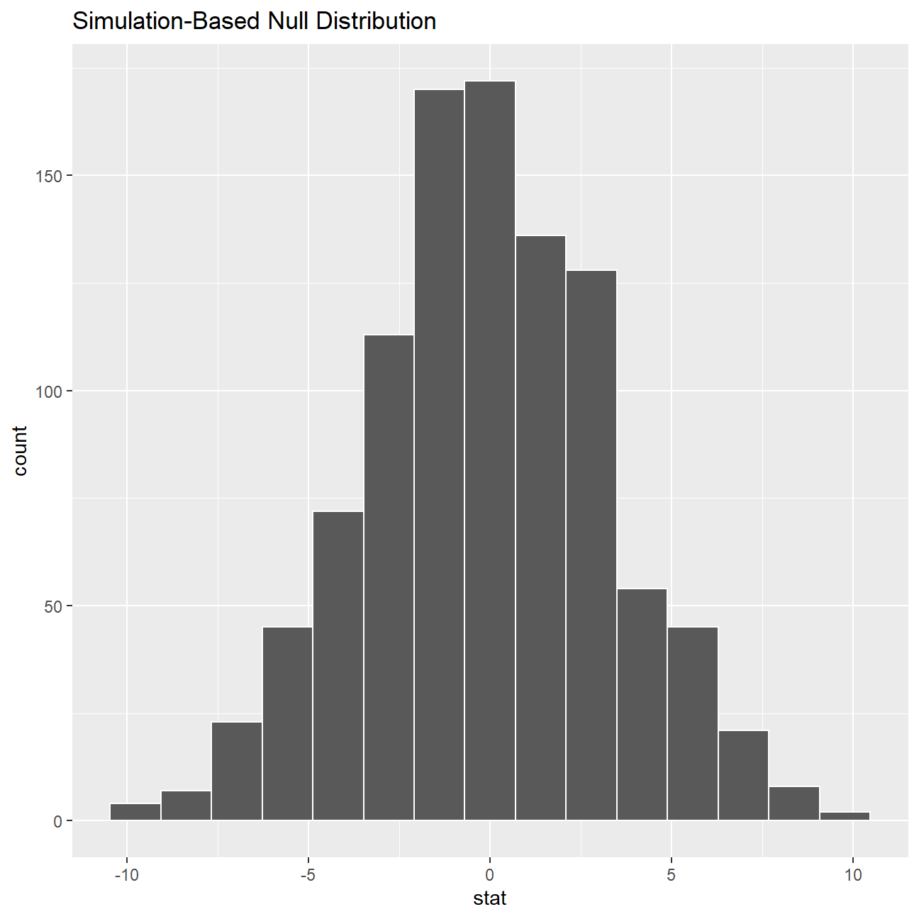
ggplot(data = null_dist_3, aes(x = stat)) +
  geom_histogram()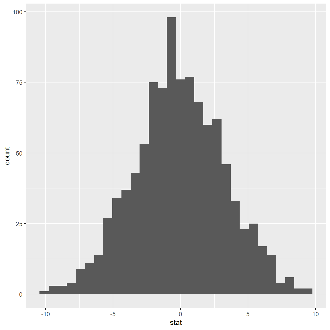
null_dist_3 %>% visualize() +
  shade_p_value(obs_stat = obs_diff_3, direction = "two-sided")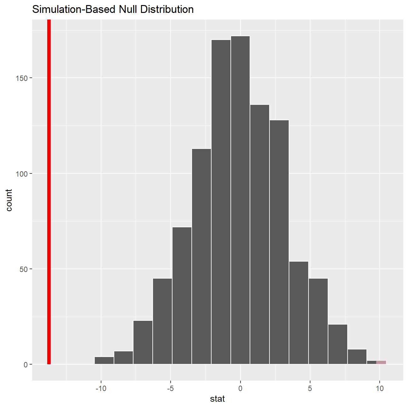
null_dist_3 %>%
  infer::get_p_value(obs_stat = obs_diff_3, direction = "two_sided")
## # A tibble: 1 x 1
## p_value
## <dbl>
## 1 0According to our calculation by t.test, our p-value for the hypothesis test is 1.225e-05, which is smaller than 0.05 and hence statistically significant. The p-value we retrieved from our simulations with the infer package is also infinitesmal and statistically significant. There is strong evidence against the null hypothesis and the -13.7 years (7.38-21.13) of difference we estimated in our sample means is really different from zero, therefore there is a significant difference.
We can safely conclude the experience levels of male executives is, on average, 13.7 years more than female counterparts.
Relationship Salary - Experience ?
Someone at the meeting argues that clearly, a more thorough analysis of the relationship between salary and experience is required before any conclusion can be drawn about whether there is any gender-based salary discrimination in the company.
Analyse the relationship between salary and experience. Draw a scatterplot to visually inspect the data
ggplot(omega, aes(x = experience, y = salary)) + geom_point() +geom_smooth(se = FALSE)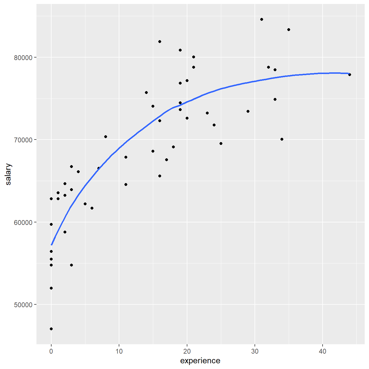 In general, there is a moderate positive relationship between executives’ salary and experience. However, the strength of this relationship becomes weaker as the experience level increases, suggesting that experience may be an important factor influencing the salary levels for early-careers and not so much important for the already experienced professionals.
Check correlations between the data
We can use GGally:ggpairs() to create a scatterplot and correlation matrix. Essentially, we change the order our variables will appear in and have the dependent variable (Y), salary, as last in our list. We then pipe the dataframe to ggpairs() with aes arguments to colour by gender and make ths plots somewhat transparent (alpha = 0.3).
omega %>%
  select(gender, experience, salary) %>% #order variables they will appear in ggpairs()
  ggpairs(aes(colour=gender, alpha = 0.3))+
  theme_bw()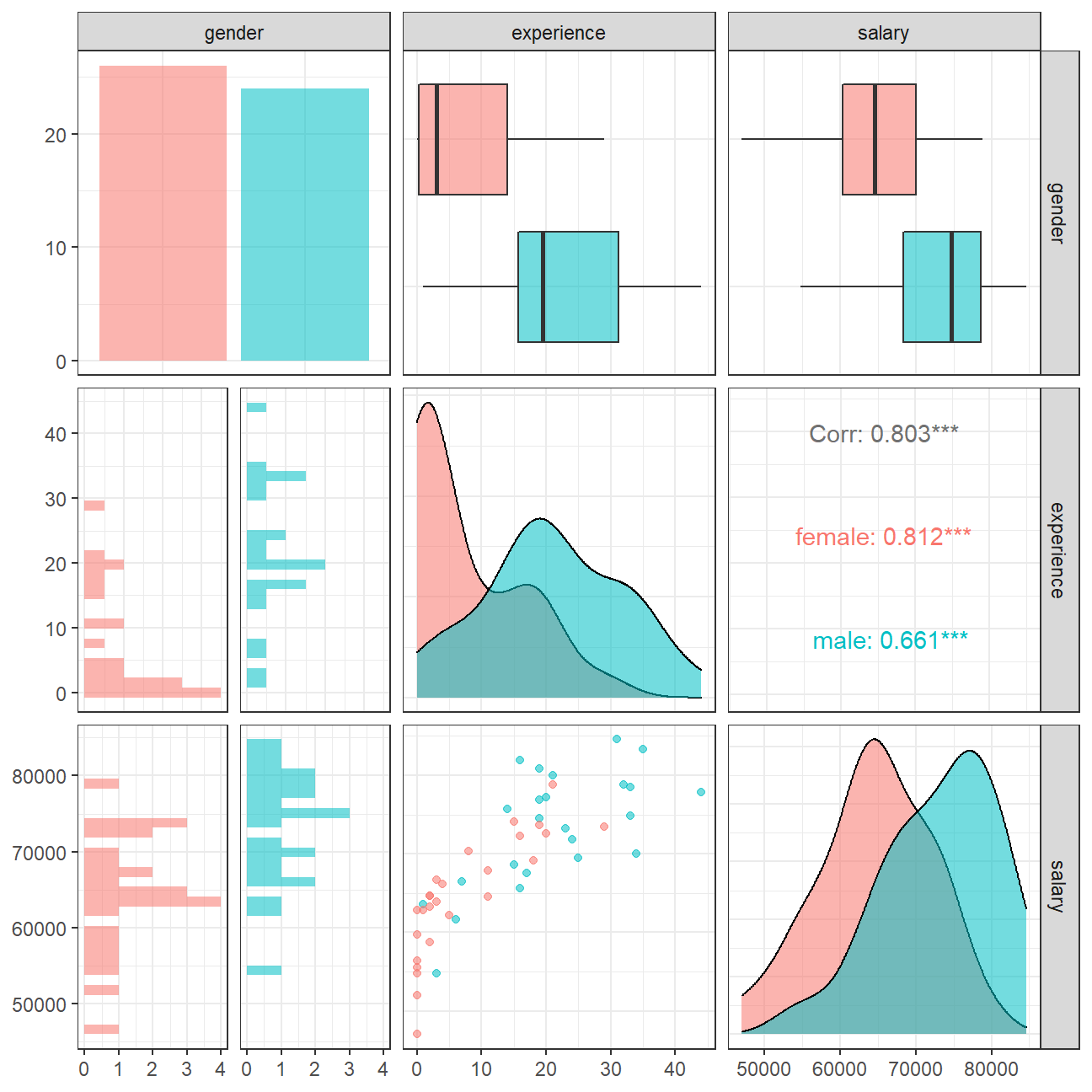
The salary vs experience scatterplot shows that female executives in this sample are more concentrated on the left side of the plot, which means that generally they have lower experience levels than their male counterparts. Given the 0.812 correlation between salary and experience levels for female executives, which is higher than the 0.661 correlation for males, it is reasonable that we see a stronger relationship between salary and experience levels for early career professionals.
However, we cannot safely conclude whether this difference in salary level between female and male executives is due to gender difference or difference in experience levels. More research is required to investigate the causal relationship on salary levels and the two different factors.
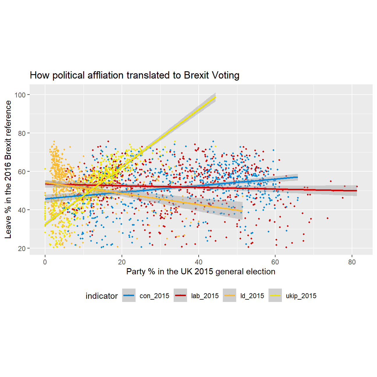
Challenge 1: Brexit plot
Using our data manipulation and visualisation skills, we will illustrate how political affliation is translated to Brexit voting.
| Name | data_brex_results |
| Number of rows | 632 |
| Number of columns | 11 |
| _______________________ | |
| Column type frequency: | |
| character | 1 |
| numeric | 10 |
| ________________________ | |
| Group variables | None |
Variable type: character
| skim_variable | n_missing | complete_rate | min | max | empty | n_unique | whitespace |
|---|---|---|---|---|---|---|---|
| Seat | 0 | 1 | 4 | 43 | 0 | 632 | 0 |
Variable type: numeric
| skim_variable | n_missing | complete_rate | mean | sd | p0 | p25 | p50 | p75 | p100 | hist |
|---|---|---|---|---|---|---|---|---|---|---|
| con_2015 | 0 | 1.00 | 36.60 | 16.22 | 0.00 | 22.09 | 40.85 | 50.84 | 65.88 | ▂▅▃▇▅ |
| lab_2015 | 0 | 1.00 | 32.30 | 16.54 | 0.00 | 17.67 | 31.20 | 44.37 | 81.30 | ▆▇▇▅▁ |
| ld_2015 | 0 | 1.00 | 7.81 | 8.36 | 0.00 | 2.97 | 4.58 | 8.57 | 51.49 | ▇▁▁▁▁ |
| ukip_2015 | 0 | 1.00 | 13.10 | 6.47 | 0.00 | 9.19 | 13.73 | 17.11 | 44.43 | ▃▇▃▁▁ |
| leave_share | 0 | 1.00 | 52.06 | 11.44 | 20.48 | 45.33 | 53.69 | 60.15 | 75.65 | ▂▂▆▇▂ |
| born_in_uk | 0 | 1.00 | 88.15 | 11.29 | 40.73 | 86.42 | 92.48 | 95.42 | 98.02 | ▁▁▁▂▇ |
| male | 0 | 1.00 | 49.07 | 0.80 | 46.86 | 48.61 | 49.02 | 49.43 | 53.05 | ▁▇▃▁▁ |
| unemployed | 0 | 1.00 | 4.37 | 1.42 | 1.84 | 3.23 | 4.19 | 5.21 | 9.53 | ▆▇▅▂▁ |
| degree | 59 | 0.91 | 16.71 | 8.36 | 5.10 | 10.79 | 14.69 | 19.59 | 51.10 | ▇▆▂▁▁ |
| age_18to24 | 0 | 1.00 | 9.29 | 3.59 | 5.73 | 7.30 | 8.28 | 9.60 | 32.68 | ▇▁▁▁▁ |
Challenge 2:GDP components over time and among countries
At the risk of oversimplifying things, the main components of gross domestic product, GDP are personal consumption (C), business investment (I), government spending (G) and net exports (exports - imports). You can read more about GDP and the different approaches in calculating at the Wikipedia GDP page.
The GDP data we will look at is from the United Nations’ National Accounts Main Aggregates Database, which contains estimates of total GDP and its components for all countries from 1970 to today. We will look at how GDP and its components have changed over time, and compare different countries and how much each component contributes to that country’s GDP. The file we will work with is GDP and its breakdown at constant 2010 prices in US Dollars.
UN_GDP_data  <-  read_excel(here::here("data", "Download-GDPconstant-USD-countries.xls"), # Excel filename
                sheet="Download-GDPconstant-USD-countr", # Sheet name
                skip=2) # Number of rows to skip
The first thing we need to do is to tidy the data, as it is in wide format and we must make it into long, tidy format. Please express all figures in billions (divide values by 1e9, or \(10^9\)), and we want to rename the indicators into something shorter.
tidy_GDP_data  <-  UN_GDP_data %>%
  pivot_longer(cols = 4:51, names_to = "Year", values_to = "Value") %>%
  mutate(Value = Value/(10^9))
glimpse(tidy_GDP_data)
## Rows: 176,880
## Columns: 5
## $ CountryID <dbl> 4, 4, 4, 4, 4, 4, 4, 4, 4, 4, 4, 4, 4, 4, 4, 4, 4, 4, 4,~
## $ Country <chr> "Afghanistan", "Afghanistan", "Afghanistan", "Afghanista~
## $ IndicatorName <chr> "Final consumption expenditure", "Final consumption expe~
## $ Year <chr> "1970", "1971", "1972", "1973", "1974", "1975", "1976", ~
## $ Value <dbl> 5.56, 5.33, 5.20, 5.75, 6.15, 6.32, 6.37, 6.90, 7.09, 6.~# Let us compare GDP components for these 3 countries
country_list <- c("United States","India", "Germany")Next, we produce a plot of GDP components over time.
three_country_data <- tidy_GDP_data %>%
  filter(Country %in% country_list) %>%
  filter(IndicatorName %in% c("Gross capital formation" ,"Exports of goods and services" ,"General government final consumption expenditure" , "Household consumption expenditure (including Non-profit institutions serving households)", "Imports of goods and services")) %>%
  mutate(Year = as.numeric(Year)) %>%
  group_by(Year)

ggplot(three_country_data, mapping = aes(x=Year, y=Value , colour=IndicatorName)) +geom_line() +
  facet_wrap(~Country) +
  labs(title = "GDP components over time", subtitle = "In constant 2010 USD", colour = "Components of GDP", x = element_blank(), y = "Billion US$") +
  scale_colour_discrete(breaks = c("Gross capital formation" ,"Exports of goods and services" ,"General government final consumption expenditure" , "Household consumption expenditure (including Non-profit institutions serving households)", "Imports of goods and services"), labels = c("Gross capital formation" ,"Exports" ,"Government expenditure" , "Household expenditure", "Imports") ) +
  theme_bw()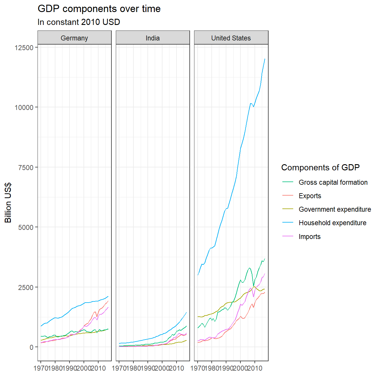
Afterwards, recall that GDP is the sum of Household Expenditure (Consumption C), Gross Capital Formation (business investment I), Government Expenditure (G) and Net Exports (exports - imports).
wide_GDP_data <- tidy_GDP_data %>%
  pivot_wider(names_from = "IndicatorName", values_from  = "Value") %>%
  clean_names()

wide_GDP_data %>%
  mutate(GDP_calculated = gross_capital_formation + general_government_final_consumption_expenditure+ household_consumption_expenditure_including_non_profit_institutions_serving_households+ exports_of_goods_and_services - imports_of_goods_and_services) %>%
  select(country, year, GDP_calculated, gross_domestic_product_gdp)
## # A tibble: 10,560 x 4
## country year GDP_calculated gross_domestic_product_gdp
## <chr> <chr> <dbl> <dbl>
## 1 Afghanistan 1970 6.35 10.7
## 2 Afghanistan 1971 6.15 10.7
## 3 Afghanistan 1972 5.94 8.94
## 4 Afghanistan 1973 6.49 9.20
## 5 Afghanistan 1974 7.09 9.70
## 6 Afghanistan 1975 7.47 10.3
## 7 Afghanistan 1976 8.20 10.9
## 8 Afghanistan 1977 8.49 10.3
## 9 Afghanistan 1978 8.98 11.1
## 10 Afghanistan 1979 8.68 10.8
## # ... with 10,550 more rows
This chart shows the separate trends of the proportions of 4 components of GDP. We can see that in terms of household expenditure, which is the biggest component of all three countries’ GDP, its proportion is relatively stable for Germany and United States and decreasing for India. Germany has the most stable household expediture level between 50% and 60%. The United States’ household expenditure exhibits a slightly increasing trend from 60% to 70%. India’s household expenditure has a sharp decreasing trend since 1980. Such differences may be due to the fact that Germany and the US are both developed countries and are already stable in development speed.
Gross capital formation, which indicates the level of investment slightly decreases over time in Germany, slightly increased in the US, and increased significantly in India especially since 2000. Hence, we can reasonably speculate that India might have gone through a period of rapid development, with households decreasing their consumption, saving more money, and initiating more investments.
Government expenditure has been stable in Germany and India, but exhibits a decreasing trend for the US, probably due to a tightening government budget and increasing level of debt. It is worth noting that India’s gross capital formation proportion in GDP has always beeen 10-30% above the government expenditure proportion level, while these two components have been competing for Germany and the US, both fluctuating at around 20%.
Net exports have been stable for India and the US before 2000 and both experienced a decrease of about 5% after then. Germany’s net export proportion level has also been stable until 2000 and experienced an increase afterwards, which suggests that it became more of an exporter than importer than it was before 2000.
Collaborators: Study Group 9